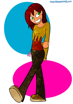
I love a girl with eyes.
So I mentioned in twitter before that I was thinking about changing the way I did the characters eyes. And after playing around with it I think I will. It’s really not going to be that different but I’m kinda excited about it and wanted to share.
So anyway, here’s the kinda thing I’m talking about:
(Click for a larger image)
I don’t know what I was thinking when playing around with the shading for this. I probably wasn’t.
Anyways, its basically taking the un-joined black lines and.. you know, joining them. I tend to draw the iris a bit bigger because of this but I think it looks pretty good. I’ll post some more sketches later.
Also the change won’t be immediate. Since I’m planning on getting stuff printed I figure I’ll keep the eyes consistent and wont change them mid story. I am working on a side story at the moment though which will be a good chance to work it in though and give it a test run. More on that later.


October 20th, 2009 at 3:04 pm
hmm, nice eyes are nice 🙂
Now I’ll be paranoid and will be focusing on the eyes, fun.
October 20th, 2009 at 3:48 pm
hOLLEEE GOD! I love this. Makes Angel even cuter. Dude carry on with it man. I mean it.
October 21st, 2009 at 1:45 am
I have to say that looks friggin awesome and you should go with this style. looks great
October 24th, 2009 at 9:03 pm
Hm, I see that you’ve put extra details into the image, excluding the eyes (such as the pants’ details). The line work (again, excluding the eyes) also seems to have changed, with more variation though that could just be me… Were these purposeful changes or just because you put more time into making the image?
Either way, I think it looks great. Plus, the shading is neat (I still think you should have shading in all the comics but that might increase the time I have to wait between updates) if not slightly.. chaotic? The eyes also just give Angel (characters in general, I presume) a little more polish, which is great. Great stuff, Jamie.
October 26th, 2009 at 7:12 am
I like it. Do it, or I’ll punch you into submission like I did to Algebra.
November 3rd, 2009 at 9:22 am
I like the shading, it makes me think of someone standing in a forest with the sun shining through the few openings in the foliage.
December 26th, 2009 at 6:18 pm
Eyes, are what we use to show emotion.
August 25th, 2010 at 1:23 am
Looks like Starfire 😛
February 12th, 2011 at 6:46 am
I like it.
August 29th, 2011 at 10:36 am
I, too, like it.
October 29th, 2011 at 10:41 am
I like this weblog it is a master piece! Glad I discovered this on google.