August 7th, 2009


Tags: Comic
This entry was posted on Friday, August 7th, 2009 at 4:13 pm and is filed under Uncategorized.
You can follow any responses to this entry through the RSS 2.0 feed.
You can leave a response, or trackback from your own site.
The Fancy Adventures of Jack Cannon – A Webcomic – is powered by WordPress with ComicPress. Subscribe RSS: Entries | Comments
August 7th, 2009 at 5:38 pm
Seriously, Max Facepuncher is like the greatest character ever.
August 7th, 2009 at 6:07 pm
Shading!
August 7th, 2009 at 6:07 pm
Oh my god shading?!
August 7th, 2009 at 6:19 pm
Spoiler Alert!
|
|
Faces are gonna get punched!
August 7th, 2009 at 6:51 pm
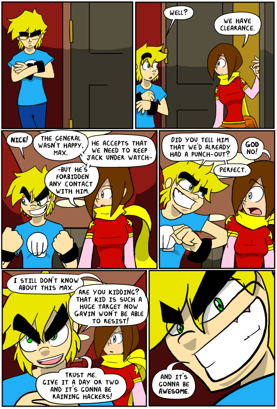
Sorry guys, the shading isn’t permanent, I was just playing around with the MI scene
August 7th, 2009 at 8:36 pm
… those eyebrows…
August 7th, 2009 at 10:06 pm
This is going to be awesome. Also I love Max’s expression in the last panel.
August 8th, 2009 at 4:19 am
I was precisely thinking “one strip ago” that it could be cool if you added shading. xD I don’t think it looks bad at all. o.o Maybe it could need a bit of practice.
Then again, I can’t even draw a triangle with a ruler, so… Not the best one to judge…
August 8th, 2009 at 4:25 am
It’s really the simplest shading I could do. Hell, the only reason I don’t do full on crazy shading is because, well, I want to be able to deliver comics when I say I can.
August 8th, 2009 at 10:31 am
Actually, the shading seems to look rather natural and fitting. Maybe that’s just because it is a quite serious point in the story. Could probably be employed in dramatic future scenes to add suspense and such. Overdoing it could take away from the general non-sequitor hilarity of the comic (and the non-non-sequitor hilarity as well), so yeah, it’s probably wise to avoid using it too much. I liked it though.
… Oh dear insanity, I just thought of calling the shading “spiffytastic.” WHAT IS WRONG WITH ME.
August 8th, 2009 at 12:36 pm
Your style seems like it changed a little. Your coloring and shading seems like it changed a lot, for the better of course. The art was great before but this page stands out as pretty kick @$$ to me. I’ll definitely buy a Jack Cannon book.
August 9th, 2009 at 4:23 pm
Something about this update seems much different, and it’s not the shading, the general artwork of this page is BEAUTIFUL, far beyond the usual. Either that or I’m very very more drunk than I thought. Oh well.
August 11th, 2009 at 11:11 am
Okay, so it’s like in the first panel Max is calm, but then he just gets more and more pumped up. I think some people might find that creepy, but to me its madly hilarious and makes so. much. sense!
@Penguin: face-punching, oh how we all enjoy it. ^U^
August 14th, 2009 at 12:02 pm
That face in the last panel is t-shirt worthy.
August 20th, 2009 at 11:38 am
I want a pocket-sized Max. Alright, a full sized one would be better, but oh the destruction and wacky antics a pocket-sized one could get into.
I say this simply because it would be disturbingly awesome to see him wreck some shit in person.
Puuuuuuuuuuuuuunch.
January 5th, 2010 at 4:26 pm
i just realised… Max face puncher either dyes his hair or his eyebrows…
or he is the love child of…
well darn; Rock Lee and that female version of cloud. ew.
also what editing program ddya use? photoshop? paint.net? fireworks?
it looks great!
March 11th, 2010 at 1:19 pm
I would so pay for that last panel to be made
into a wall poster(or avatar)words and all
May 29th, 2010 at 11:31 pm
No good can come from the expresion in the last panel. But that’s not necesarily a bad thing. 🙂
February 22nd, 2012 at 10:09 am
I keep reading Max’s dialogue in the voice of Kittan Black.
Why is this?